How to Choose a Color Palette for Your Coaching Website
When I first started building my brand, I was convinced turquoise was my color. I live in a tropical climate where vibrant hues are everywhere — sunny yellows, lush greens, ocean blues — and it felt natural to bring that energy into my business.
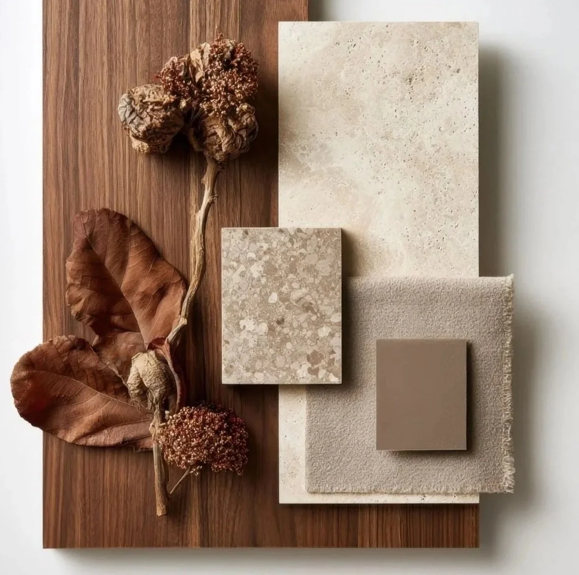
But as I started working with more clients, something interesting happened: they almost always described me using the same two words — gentle and patient. And when I looked back at the inspiration boards I'd created for my own brand, turquoise wasn't there at all. Sage greens, muted pinks, and soft peachy tones kept showing up instead.
That's when I realized something I now teach my clients every day: choosing your brand colors is never just a practical decision — it's an intuitive one.
This article walks you through both sides of that process: the practical considerations that shape a strong color strategy, and the felt, instinctive approach that helps you build a palette truly aligned with who you are.
In this post:
5 reasons your website colors matter.
What to consider when choosing colors that reflect your brand personality.
How to check color contrast and make your palette more accessible.
What different colors can communicate to your audience.
Three steps to create a cohesive palette using inspiration, intuition, and basic color harmonies
5 Reasons Why Website Colors Matter
1. Color Shapes First Impressions
Color is one of the fastest signals the brain processes. Within milliseconds, your visual system interprets hue, brightness, and contrast — and those signals can influence emotional and memory-related responses before anyone reads a single word.
Pro tip: Get familiar with the basics of color perception — not to overthink every shade, but to understand the mood and impression your palette creates the moment someone lands on your site.
2. Color Guides User Behavior
Color influences how people navigate, interact, and click. We're naturally wired to notice contrast and saturation changes, and in web design, that translates directly into behavior.
Pro tip: Use clear, high-contrast buttons to boost visibility and clicks.
3. Color Supports Accessibility
Strong contrast and readable color combinations ensure your site works for everyone — including people with low vision, color blindness, or processing differences.
Pro tip: Check your color contrast before you start designing. A two-minute test can save hours of redesign later.
4. Color Reinforces Brand Identity
Your palette communicates mood, energy, and personality. Bright colors feel social and energetic; neutrals feel calm and grounded; darker tones feel elegant or dramatic. The right colors strengthen your message — the wrong ones dilute it.
Pro tip: Make sure your visuals and copy tell the same story. You wouldn't pair pastels with a gym tagline that reads "No Excuses. Just Results."
5. Color is Memorable
Color is one of the strongest memory triggers. A cohesive palette makes your brand recognizable long after someone has scrolled away.
Pro tip: Use your palette consistently across your site and socials. Repetition builds recognition. Recognition builds familiarity. Familiarity builds trust.
What to Consider When Picking Your Brand Colors
I always ask my clients the same question: "How do you want people to feel when they land on your site?"
Because emotion is the first language of design. The right palette is where UX, psychology, accessibility, and intuition meet — emotion opens the door, and function keeps people inside.
Here's what to think through:
Brand personality. Your colors should reflect your vibe, values, and voice. Bold and energetic? Calm and grounding? Playful? Elegant? Choose shades that feel like a natural extension of you and the experience you want to create.
The overall experience. Think beyond a single emotion. Colors influence how users move through your site, what they notice first, and where they pause or click.
Accessibility. Your palette should stay readable for people with visual differences. That means checking contrast ratios, avoiding color-only indicators, and steering clear of combinations like a pastel font on a pastel background — which is genuinely hard to read.
Consistency. When buttons, headings, and sections follow predictable color patterns across pages, the whole experience feels clear and trustworthy.
UI clarity. Clickable elements, form fields, hover states, and error messages should be instantly recognizable. Color should make interaction obvious.
How to Know if Your Website Is Accessible
Contrast Ratios
Text and background colors need strong contrast to be readable everywhere. WCAG (Web Content Accessibility Guidelines) recommends:
4.5:1 for normal text
3:1 for large text
A great free tool is Coolors Contrast Checker — it follows WCAG guidelines and instantly shows contrast ratings for any color pair.
Text Readability
Watch out for:
Low-contrast pastels
Text placed over busy backgrounds
Light text on light accents (like white text on a pale pink button)
Small font sizes paired with low-contrast colors — small text needs higher contrast, not lower
When in doubt: clarity over aesthetics.
Colorblind-Safe Combinations
Color blindness doesn't mean someone sees in black and white — it means certain colors look similar or blend together. About 1 in 12 men and 1 in 200 women experience some form of it, so this may affect a meaningful portion of your audience.
The most common challenges:
Red vs. green → both may appear as muted brown
Blue vs. purple → purple can look like a shade of blue
Green vs. brown → can blend together, especially in low contrast
The fix: use color plus another cue — a text label, icon, underline, or shape change — so meaning never relies on color alone.
Interactive Elements
Buttons, links, and hover states should feel clearly clickable. Reinforce color with other signals like underlines, shadows, outlines, or visible hover changes.
What Do Your Brand Colors Communicate?
Here's a quick reference for common color associations:
🔵 Blue: calm, trust, reliability
🟢 Green: balance, growth, renewal
🔴 Red: passion, urgency, impact
🟠 Orange: enthusiasm, confidence
🟡 Yellow: joy, warmth, curiosity
🟣 Purple: depth, imagination, luxury
⚫️ Black: strength, modernity, premium
⚪️ White: clarity, simplicity, openness
Keep in mind that variations within a color carry their own meaning.
Take pink:
Soft blush → calm, nurturing, elegant
Mid-tone pink → friendly, approachable
Coral/bright pink → energetic, bold, youthful
Hot pink/fuchsia → expressive, confident, statement-making

FUN FACT:
The yellow-and-black pattern on bees and wasps is a natural warning signal evolved to deter predators. Humans independently landed on the same high-contrast combination for caution tape and hazard signs.
3 Steps to Build (or Rebuild) Your Brand Palette
1. Create a Pinterest inspiration board. Collect images, spaces, outfits, artwork — anything that feels like you. Then look for patterns. The colors that keep showing up are clues to your natural aesthetic.
2. Turn an image you love into a palette. Use Canva's Color Palette Generator to pull tones directly from a photo. It's an easy way to translate the mood of an image into a usable, cohesive set of colors.
3. Learn basic color harmonies. Understanding simple color relationships — analogous, complementary, triadic — helps you quickly see which colors work together and which will fight each other on a page.
Key Takeaways
Color shapes UX, readability, memory, and behavior
Your palette is both a design tool and a communication tool
Accessibility should guide every color decision
Intuition matters as much as strategy
Inspiration boards reveal your real preferences
Always test contrast before designing
Keep your palette simple and consistent
Want help creating a memorable color palette for your brand?